 Driftless Meditations
One Dot per Person
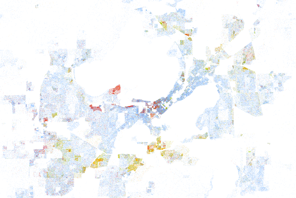 Cartographer’s-eye view of Madison, Wisconsin, the home of Walking Point. Screenshot taken from the map created by Dustin Cable of the University of Virginia’s Weldon Cooper Center for Public Service.
Via Wired, an incredible piece of cartography:
Drawing on data from the 2010 U.S. Census, it shows one dot per person, color-coded by race. That’s 308,745,538 dots in all–around 7 GB of visual data. It isn’t the first map to show the country’s ethnic distribution, nor is it the first to show every single citizen, but it is the first to do both, making it the most comprehensive map of race in America ever created.
White people are shown with blue dots; African-Americans with green; Asians with red; and Latinos with orange, with all other race categories from the Census represented by brown. Since the dots are smaller than pixels at most zoom levels, Cable assigned shades of color based on the multiple dots therein. From a distance, for example, certain neighborhoods will look purple, but zooming-in reveals a finer-grained breakdown of red and blue–or, really, black and white.
I imagine much of the focus will be on the cities that always come up when talking about urban segregation: Chicago, New York, Los Angeles, Washington D.C., etc. What really draws me to this map is the opportunity to look at some of my favorite cities to visit — Minneapolis, Denver, Seattle, San Diego — and learn something new about them.